

Pivot Tables are Excel’s fastest way to summarize large lists into totals, counts, averages, and breakdowns by category. Instead of building multiple formulas or manually filtering and adding, you can drag fields into rows, columns, and values to create an instant report.
You typically use Pivot Tables when you need answers like “total sales by region,” “units by product,” “monthly totals,” or “top reps by revenue.” If you only need a single conditional total in a worksheet cell, a formula like SUMIF may be enough. For returning filtered rows (not summaries), see FILTER.
This tutorial focuses on Pivot Tables in Microsoft Excel (Windows and Mac). The steps apply to modern Excel versions, including Microsoft 365 and Excel 2016/2019/2021 and later.
Key Features and Use Cases
Pivot Tables solve the “I need a summary now” problem. They let you reorganize the same dataset into multiple views without rewriting formulas.
- Summarize large datasets into totals, counts, and averages
- Group dates into months/quarters/years
- Filter and slice results without changing your source data
- Build repeatable reports you can refresh when new rows are added
- Create Pivot Charts for quick visuals
Platform Compatibility
- Excel: Yes (Windows and Mac)
- Google Sheets: Pivot tables exist, but this tutorial is Excel-specific
Sample Data Used in Examples
The examples below use a simple sales log with one row per order. You’ll build Pivot Tables that summarize Amount by Region, Rep, Product, and Month.
OrderID	Date	Region	Rep	Product	Units	UnitPrice	Amount
1001	2026-01-03	East	Ava	Notebook	8	4.50
1002	2026-01-05	West	Noah	Pens	12	1.20	14.40
1003	2026-01-06	East	Liam	Markers	5	2.80	14.00
1004	2026-01-10	South	Emma	Stapler	2	9.90	19.80
1005	2026-01-12	North	Noah	Notebook	10	4.50
1006	2026-01-15	East	Ava	Pens	20	1.20	24.00
1007	2026-01-18	West	Sophia	Notebook	6	4.50
1008	2026-01-21	East	Emma	Stapler	1	9.90	9.90
1009	2026-01-25	South	Liam	Markers	9	2.80	25.20
1010	2026-01-28	North	Sophia	Pens	15	1.20	18.00
1011	2026-02-02	East	Noah	Notebook	7	4.50
1012	2026-02-04	West	Ava	Markers	4	2.80	11.20
How to Create a Pivot Table in Excel
Before you build the Pivot Table, make sure your data has:
- One header row (no blanks in the header row)
- One record per row (no subtotal rows inside the data)
- Consistent column types (dates as dates, amounts as numbers)
Step-by-Step: Insert a Pivot Table
-
Paste the sample data into a worksheet starting in cell A1.
-
Click any cell inside the dataset (for example, A1).
-
Go to Insert > PivotTable.
-
In the dialog, confirm the Table/Range covers your dataset.
-
Select New Worksheet (recommended), then click OK.
You’ll see an empty Pivot Table area and a field list where you can drag columns into Rows, Columns, Values, and Filters.
Step-by-Step: Build a Basic Summary
-
Drag Region to Rows.
-
Drag Amount to Values.
Excel will produce a summary total of Amount by Region.
Pivot Table Examples
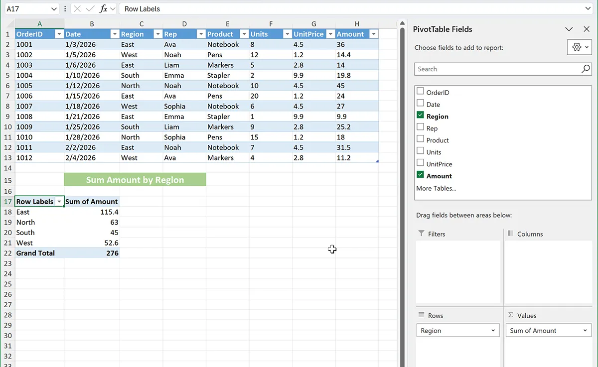
Example 1: Basic Pivot Table (Total Amount by Region)
Platform: Excel
Scenario: You need a quick summary of total sales (Amount) by Region.
-
Click anywhere inside your source data (for example, A1).
-
Go to Insert > PivotTable > OK (New Worksheet).
-
In the PivotTable Fields panel, drag Region to Rows.
-
Drag Amount to Values.
-
Expected result: A table listing each Region with a sum of Amount.
How it works: Pivot Tables group rows by the field in Rows (Region) and aggregate numeric fields in Values (Amount). By default, Amount should summarize as Sum.
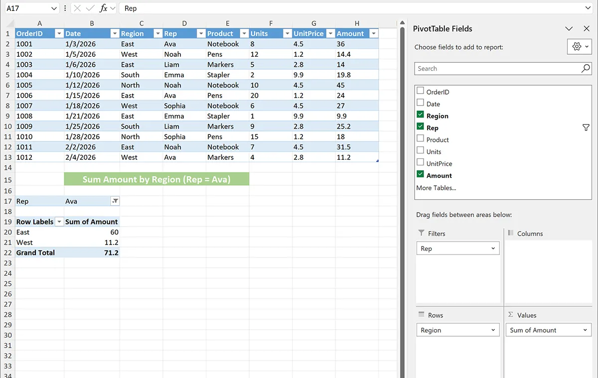
Example 2: Add a Report Filter (Show One Rep at a Time)
Platform: Excel
Scenario: You want the same Region summary, but you want to filter the entire Pivot Table to a single Rep.
-
Start with the Pivot Table from Example 1.
-
Drag Rep into the Filters area.
-
At the top of the Pivot Table, open the Rep filter dropdown and select one rep (for example, Ava).
-
Expected result: The Region totals update to show only rows for the selected rep.
How it works: The Filters area applies a report-level filter, changing which source rows are included in the Pivot Table calculations.
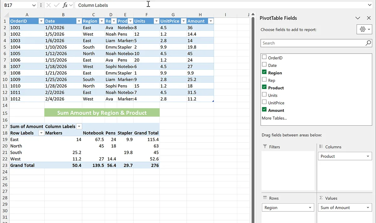
Example 3: Show Product as Columns (Region by Product Matrix)
Platform: Excel
Scenario: You want a matrix view: Regions down the left and Products across the top, showing Amount totals in the grid.
-
Start with the Pivot Table from Example 1.
-
Drag Product into the Columns area.
-
Confirm Amount remains in Values.
-
Expected result: A cross-tab where each cell is the summed Amount for that Region and Product.
How it works: Rows define the left-side grouping, Columns define the top-side grouping, and Values fills the intersections with an aggregate (Sum of Amount).
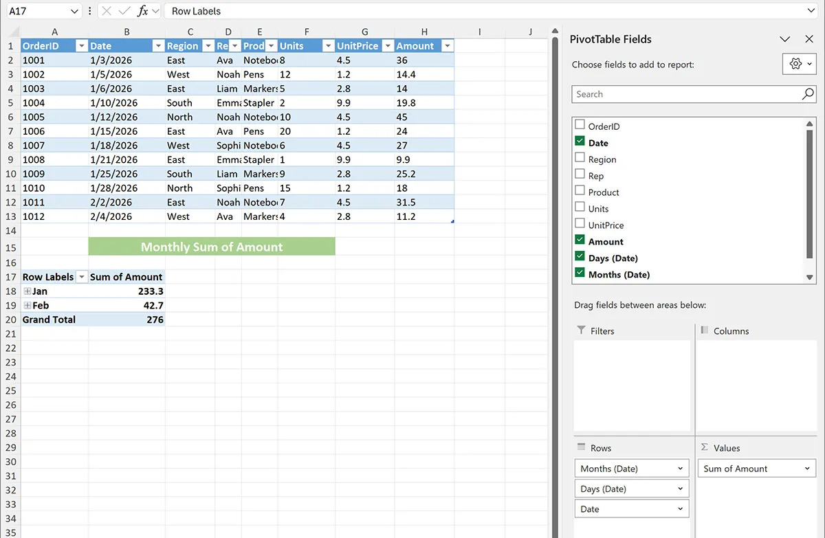
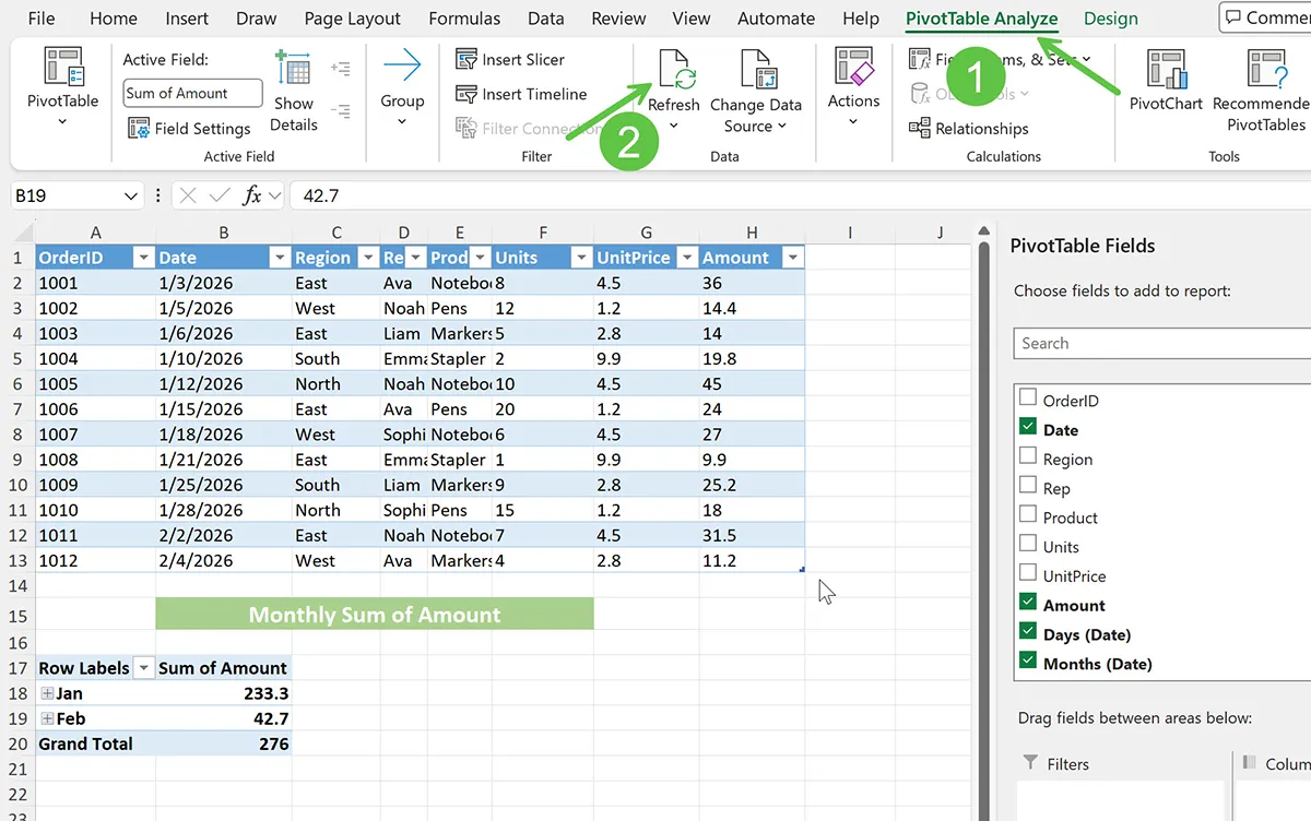
Example 4: Group Dates by Month (Monthly Total Amount)
Platform: Excel
Scenario: You want to summarize total Amount by month without adding helper columns.
-
Create a new Pivot Table from the dataset (or reuse an existing one).
-
Drag Date to Rows.
-
Drag Amount to Values.
-
In the Pivot Table, right-click any date in the Row Labels column and choose Group.
-
Select Months (and Years if your dataset spans multiple years), then click OK.
-
Expected result: The Row Labels show months (and possibly years) with summed Amount per period.
How it works: Grouping changes the Pivot Table’s row field from individual dates to time buckets, while Values continues to summarize Amount inside each bucket.
Example 5: Troubleshooting (Pivot Table Totals Look Wrong or Don’t Update)
Platform: Excel
Scenario: Your Pivot Table totals look incorrect, or you added new rows to the source data and the Pivot Table didn’t change.
-
Refresh the Pivot Table: Click anywhere inside the Pivot Table > go to PivotTable Analyze (or Analyze) > Refresh.
-
Check the source range: If you added rows beyond the original range, the Pivot Table may not include them. Use PivotTable Analyze > Change Data Source and expand the range.
-
Best practice fix: Convert your data to an Excel Table first (click in data > Ctrl+T on Windows or Cmd+T on Mac). Then build the Pivot Table from the Table so it automatically expands.
-
Check for text numbers: If Amount is stored as text, sums may behave unexpectedly. Convert Amount to real numbers and refresh.
How it works: Pivot Tables cache results for speed. Refresh forces Excel to re-read the source data. Using an Excel Table as the source helps keep ranges accurate as data grows.
Pivot Tables vs Alternatives
Pivot Tables are best when you need interactive summaries and multiple breakdowns. Formulas are best when you need results embedded in specific worksheet cells or dashboards that must recalculate instantly as users change criteria cells.
-
Use a Pivot Table when you want fast, drag-and-drop summaries (totals by region, product, rep, month) and you may need multiple report views.
-
Use SUMIF/SUMIFS when you need a single conditional total inside a cell-driven dashboard. See SUMIF for single-condition totals.
-
Use FILTER when you want the matching rows returned (not summarized totals). See FILTER.
-
Use manual sorting/filtering only for one-off checks; it’s slower and easier to make mistakes.
Common Errors and Fixes
-
PivotTable Fields panel is missing: Click inside the Pivot Table, then enable the field list from the PivotTable Analyze/Options tab.
-
Totals show Count instead of Sum: Excel may be treating Amount as text.
Fix: Convert Amount to numbers, refresh the Pivot Table, and (if needed) click the dropdown on the Values field > Value Field Settings > choose Sum.
-
Grouping won’t work on dates: The Date column may contain blanks or text values.
Fix: Remove blanks, convert text to dates, then try grouping again.
-
New rows aren’t included: The Pivot Table source range didn’t expand.
Fix: Change Data Source or use an Excel Table as the source, then refresh.
-
Pivot Table won’t build correctly: Your dataset may have blank headers or merged cells.
Fix: Ensure every column has a header and remove merges in the source data range.
Practical Use Cases
-
Sales reporting: totals by region, rep, and product
-
Finance: monthly spend by vendor or category
-
Operations: units shipped by warehouse and week
-
Customer support: ticket counts by type and priority
-
Inventory: quantity by SKU and location
Conclusion
Pivot Tables are the quickest way to turn a raw list into a clean summary without writing formulas. Start with a well-structured dataset, insert a Pivot Table, then drag fields into Rows, Columns, Values, and Filters. When data changes, refresh (and use an Excel Table source so your Pivot Table expands automatically).
Mental model to remember: your source data is the “detail,” and the Pivot Table is the “summary view” you can rearrange at any time.