

Designing professional business slides is less about “making it pretty” and more about making information easy to scan, easy to remember, and easy to trust. The best decks feel clean and confident: consistent fonts, aligned objects, restrained color, and visuals that support the message instead of competing with it.
This guide is a practical, step-by-step tutorial for building a polished deck in Microsoft PowerPoint and Google Slides. You’ll learn the design rules that work in both tools, then apply them using Slide Master (PowerPoint) and Edit master (Google Slides) so every slide stays consistent—without fixing formatting over and over again.
You’ll also get lots of spots to add real screenshots as you follow along (ideal for learners), plus a complete FAQ section and schema markup for SEO.
Overview
A business slide deck usually supports one of these goals:
- Explain (training, onboarding, how-to)
- Persuade (pitch decks, proposals, budget requests)
- Report (QBRs, status updates, KPIs, exec summaries)
In all three cases, the audience is short on time. That’s why professional slides rely on:
- Consistency (fonts, spacing, visual style)
- Hierarchy (headline takeaway → supporting details)
- Clarity (less text, more structure)
If your deck includes numbers or reporting slides, you’ll often be pulling data from spreadsheets. If you’re building charts or KPI rollups, also bookmark these related MagnetClicks guides to level up your data workflow:
Pivot Tables in Excel,
SUMIF,
SUM,
and FILTER.
What You Will Learn
- What makes a slide look “professional” in business settings
- A reusable design system: fonts, colors, spacing, and layouts
- PowerPoint workflow: themes, Slide Master, guides, charts, and export
- Google Slides workflow: themes, Edit master, alignment, linked charts, and sharing
- Professional slide layout examples you can copy (title, agenda, data, and closing)
- Common mistakes that break a deck (and fast fixes)
Prerequisites
- PowerPoint (Windows/Mac) and/or Google Slides (desktop browser)
- Optional: your brand color(s), logo, and a simple deck outline
- 10–15 minutes to set up master layouts (then slides become fast)
What Makes a Slide “Professional”?
Professional business slides are designed for scanning. People don’t read slides like documents—they glance at them while listening to you. A professional slide typically has one main message, expressed as a headline takeaway, with supporting details arranged in a clean structure.
Professional Slide Checklist
- Takeaway headline (not just the topic)
- One message per slide (avoid “everything slides”)
- Two fonts max (consistent sizes and weights)
- Consistent margins (use guides / alignment tools)
- Limited color palette (primary + neutral + accent)
- Readable from distance (18–24 pt body text)
- Visual support (icons, charts, diagrams—used consistently)
https://magnetclicks.com/wp-content/uploads/2026/02/design-professional-business-slides.webp

Design Principles That Work in Both PowerPoint and Google Slides
1) Write a Takeaway Headline
A slide title like “Q1 Results” is a topic. A professional headline states the meaning: “Q1 revenue grew 18% driven by renewals”. This helps the audience understand the point instantly.
2) Keep Text Tight (Use the 6×6 guideline as a guardrail)
A practical rule: around 6 lines and about 6 words per line. It’s not strict, but it prevents paragraph-heavy slides that look like documents. If you need paragraph detail, move it into speaker notes, a follow-up email, or a separate doc.
3) Two Fonts Max (and use size/weight for hierarchy)
Professional decks usually stick to one font family or a clean pair:
- Headings: larger and bold
- Body: smaller and regular weight
Avoid mixing too many fonts—it makes slides feel inconsistent and “template-y.”
4) Build a Simple Color System
A business palette should be predictable:
- Primary: your main brand color for emphasis
- Neutral: dark text + light backgrounds for readability
- Accent: one extra color used sparingly (callouts, highlights)
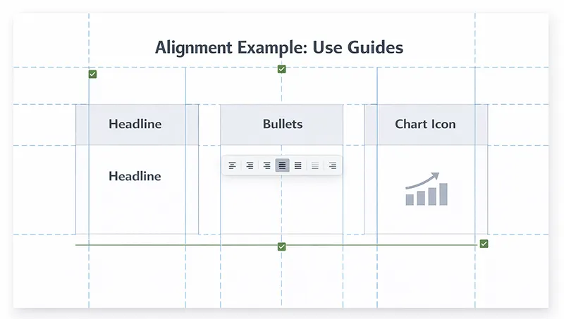
5) Align Everything to an Invisible Grid
Misalignment is one of the fastest ways to make slides look unprofessional. Use guides and alignment tools so objects line up perfectly—especially titles, text boxes, charts, and icons.
6) Use Visuals That Match Each Other
If you use icons, use the same style across the deck (same stroke thickness, same fill style, same corner roundness). If you use photos, keep a consistent tone and crop style. Random visual styles make the deck feel messy.
Step-by-Step: Design Professional Slides in PowerPoint
PowerPoint is excellent for precise control: Slide Master, layout grids, and advanced formatting make it a strong choice for executive decks and high-polish presentations.
Step 1: Start with the Right Slide Size (16:9 recommended)
- Open PowerPoint.
- Go to Design > Slide Size.
- Select Widescreen (16:9) for modern displays and video calls.
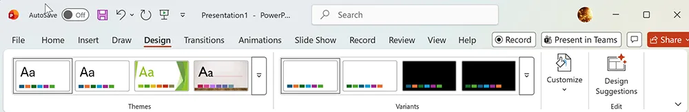
Step 2: Pick a Clean Theme (then customize)
- Go to Design and choose a simple theme.
- Avoid heavy textures or busy background graphics.
- Think “blank canvas + consistent structure.”
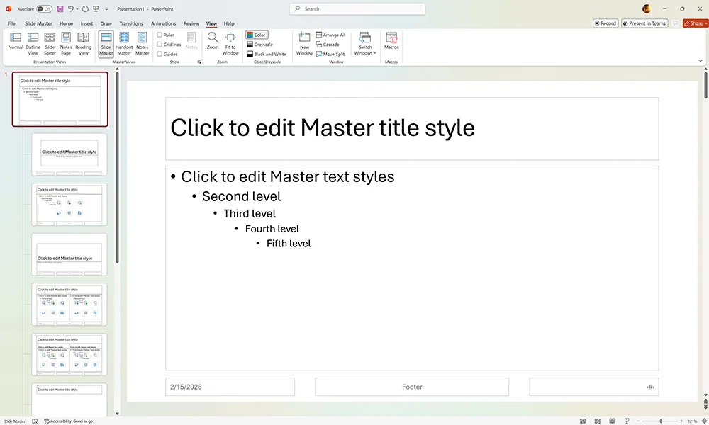
Step 3: Lock Consistency Using Slide Master
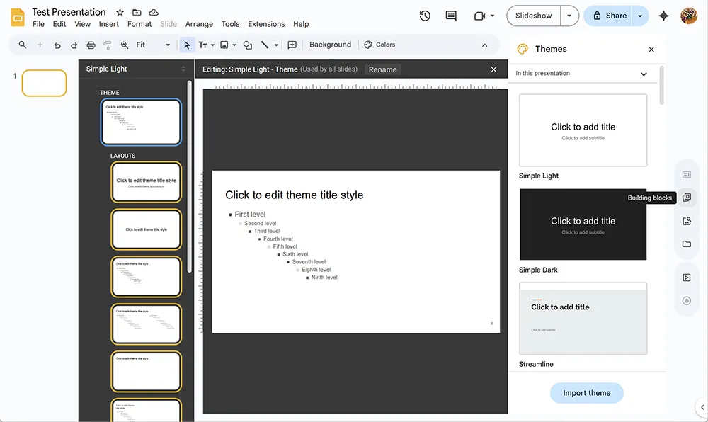
Slide Master is where professional decks are made. Instead of fixing fonts and spacing slide-by-slide, set the rules once in Slide Master so every slide stays consistent.
- Go to View > Slide Master.
- Select the top master slide (the biggest one).
- Set default fonts for titles and body text.
- Set consistent margins by positioning placeholders neatly.
- Create or refine your key layouts (examples below).
- Click Close Master View.
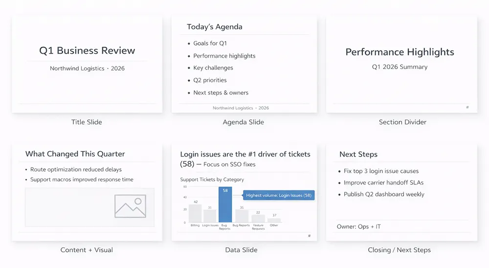
Recommended PowerPoint Layouts to Create in Slide Master
- Title Slide: big title + subtitle + optional logo
- Agenda Slide: 3–6 items with consistent spacing
- Section Divider: large section label, minimal text
- Content + Visual: text left, visual right (or reversed)
- Data Slide: takeaway headline + chart + callout
- Closing / Next Steps: 3 actions, owner/date (optional)
Step 4: Set Typography Rules (Readable in meetings)
- Titles: often 32–44 pt depending on room size
- Body text: generally 18–24 pt
- Line spacing: keep it airy (avoid crammed paragraphs)
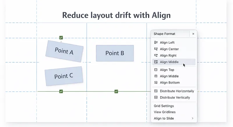
Step 5: Use Guides + Align Tools (the “corporate” secret)
- Go to View.
- Enable Guides.
- Select objects > use Shape Format > Align to line them up.
- Use Distribute to keep spacing even between items.
Step 6: Build a Strong Agenda and Section Structure
Most professional decks use an obvious structure: agenda, section dividers, and consistent slide headers. This improves navigation—especially for longer presentations and training decks.
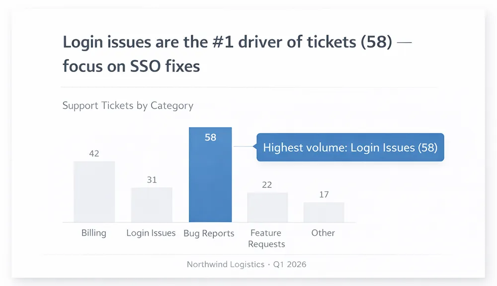
Step 7: Create Professional Data Slides (meaning first, chart second)
A common mistake is placing a chart on a slide and hoping the audience interprets it. Instead:
- Write a takeaway headline (what the data means)
- Keep the chart simple (remove clutter)
- Highlight one insight with a callout
If your slide reporting depends on spreadsheet analysis, you’ll often use quick calculations (like SUMIF or FORECAST) and filtered views (FILTER) to prep the visuals before you paste or link them into slides.
Step 8: Keep Transitions + Animations Minimal
- Use Fade or no transition for most decks.
- Use animations only to reveal steps (not decoration).
- Avoid bouncing/spinning effects in business settings.
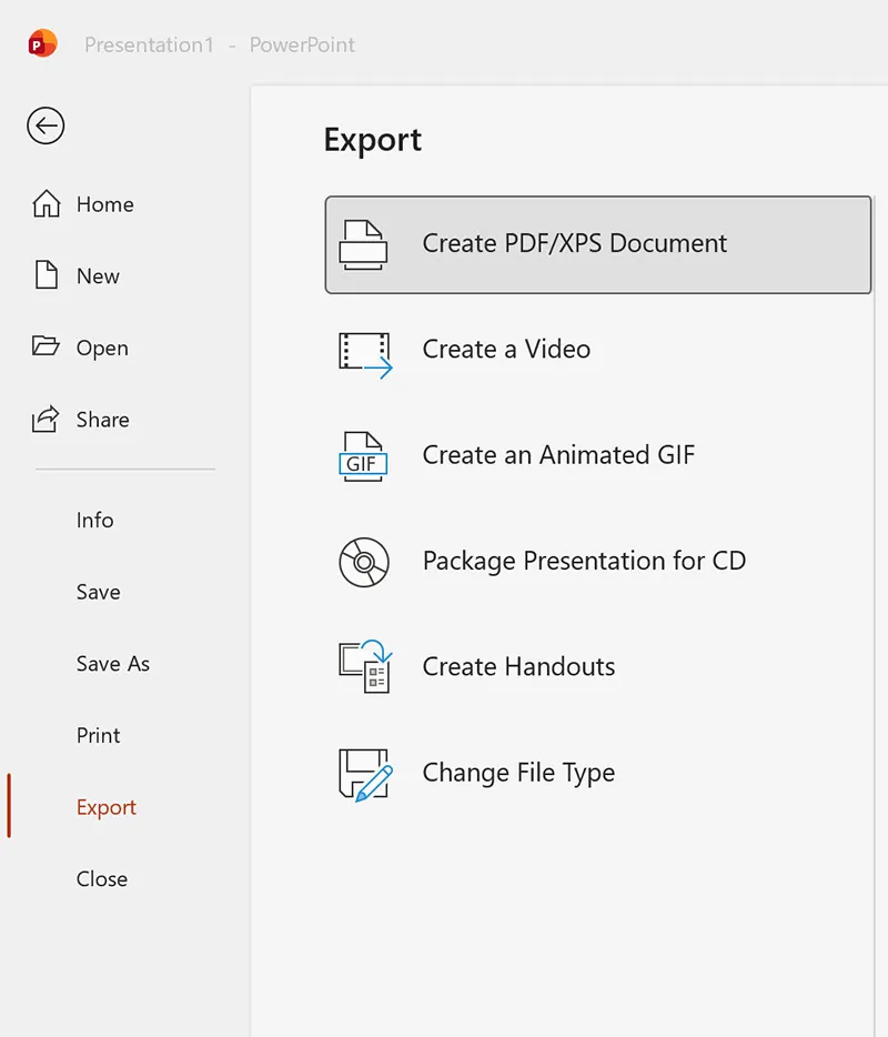
Step 9: Export Like a Pro (PDF + video options)
Professional delivery often needs multiple outputs: a PDF for sharing, a deck file for presenting, or even a video recording for async updates.
- PDF: File > Export / Save As > PDF
- Video: File > Export > Create a Video (if needed)
Step-by-Step: Design Professional Slides in Google Slides
Google Slides is a strong choice when collaboration and speed matter. A professional Slides deck is built the same way: define your rules once in master settings, then reuse layouts.
Step 1: Set the Deck Structure First (outline before design)
Before you design, outline your sections:
- Title
- Agenda
- Section 1 (3–5 slides)
- Section 2 (3–5 slides)
- Data / results
- Next steps / closing
Step 2: Choose a Simple Theme
- Open Google Slides.
- Click Theme.
- Select a clean theme with minimal background graphics.
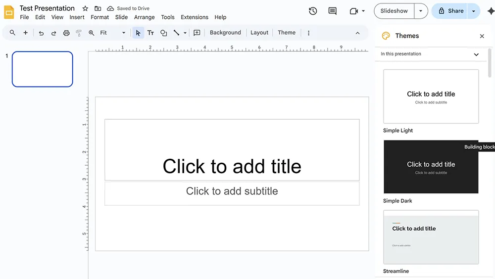
Step 3: Customize Consistency Using Edit master
- Click Slide > Edit master.
- On the master slide, set your fonts and default styles.
- Adjust layout slides for your reusable formats.
- Exit master view when done.
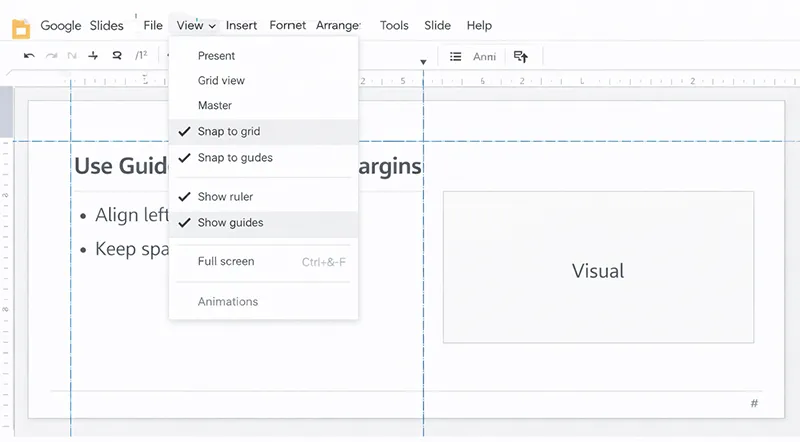
Step 4: Use Guides + Align Tools
- Enable ruler: View > Show ruler.
- Drag guides from the ruler to set margins.
- Use Arrange > Align for clean alignment.
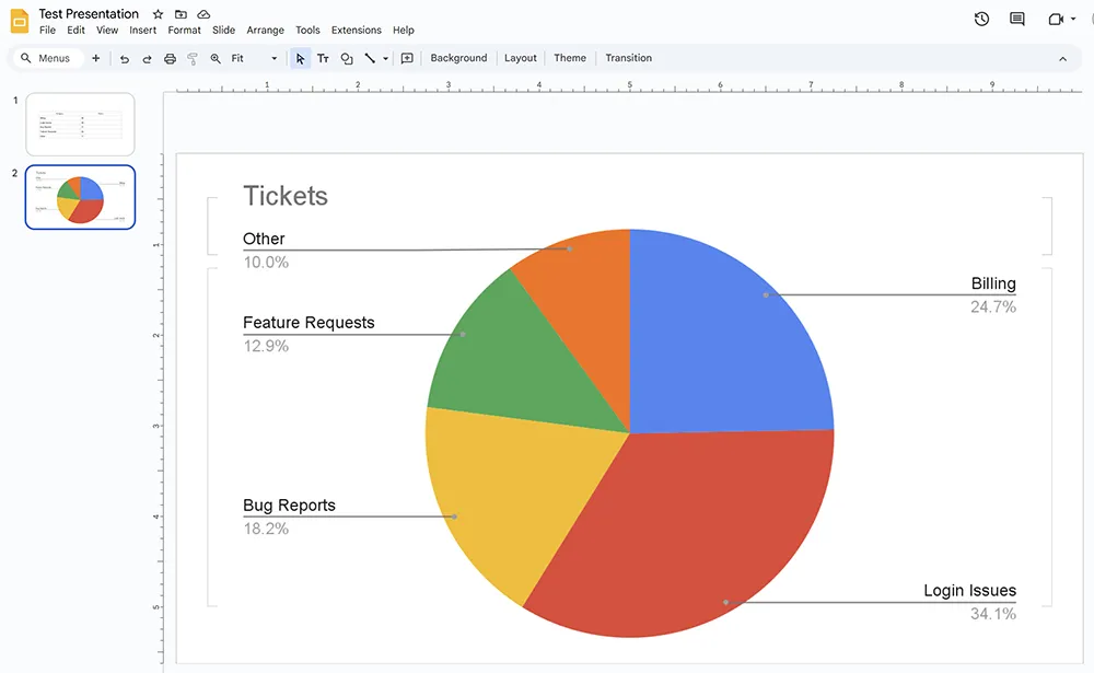
Step 5: Insert Charts from Google Sheets (Linked for updates)
- Click Insert > Chart > From Sheets.
- Select a chart and click Import.
- Keep it linked if data will update (recommended for reports).
- Add a takeaway headline and one callout.
If you’re preparing charts in Sheets, knowing fast logic and totals makes reporting easier. For example, you might use SUM for totals, SUMIF for conditional totals, or FORECAST for trend projections.
Step 6: Collaboration Tips (avoid layout drift)
When multiple people edit slides, formatting can drift. These habits keep decks professional:
- Use master layouts instead of manual text boxes.
- Duplicate slides rather than rebuilding them.
- Limit who edits master settings to maintain consistency.
- Use comments for feedback instead of moving objects around.
For collaboration beyond slides (like shared processes and documentation), you may also want to standardize forms and templates. If your workflow includes structured intake (requests, approvals, onboarding), see:
How to Create Fillable Forms in Microsoft Word and
Microsoft Word Beginner’s Guide.
Professional Slide Layout Examples You Can Copy
Below are five layouts that cover most business decks. Create them once in Slide Master / Edit master, then reuse them forever.
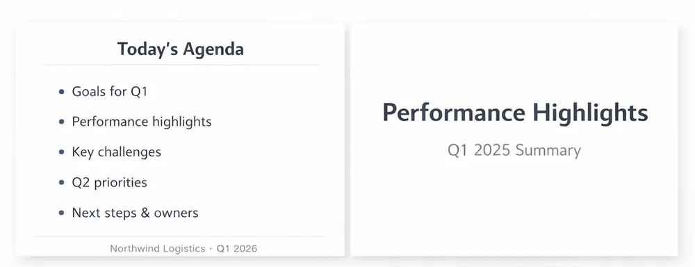
Layout 1: Title Slide
- Short title (5–8 words)
- Subtitle (optional)
- Date + presenter name (small)
Layout 2: Agenda
- 3–6 items max
- Consistent indentation and spacing
- Optional: simple icons or numbers for scanning
Layout 3: Section Divider
- Large section name
- Minimal extra text
- Optional: subtle brand color bar
Layout 4: Content + Visual
- Left: 2–3 bullets or short labels
- Right: image, diagram, icon list, or chart
Layout 5: Data / KPI Slide
- Takeaway headline
- Simple chart
- 1–2 callouts highlighting the insight
Layout 6: Closing / Next Steps
- 3 actions max
- Owner + due date (optional)
- Contact info (optional)
Common Mistakes That Make Slides Look Unprofessional (And Fixes)
Mistake 1: Paragraph Slides
Fix: Convert paragraphs into a takeaway headline + 2–3 bullets, or create a simple diagram. Move detail into speaker notes or a handout.
Mistake 2: Too Many Fonts
Fix: Lock typography in Slide Master / Edit master. Use two fonts max and consistent sizes across slides.
Mistake 3: Misalignment
Fix: Turn on guides, use Align and Distribute tools, and keep consistent margins.
Mistake 4: Too Many Colors
Fix: Limit palette to primary + neutral + accent. Use accent color only for highlights and callouts.
Mistake 5: Visual Style Clash
Fix: Use one icon set style and one photo style (consistent crops, consistent tone). Avoid mixing flat icons with 3D icons, or random photo styles.
Mistake 6: Confusing Data Slides
Fix: Lead with the meaning. If needed, rebuild your source table first. Pivot tables and clean columns often produce better charts (see:
Pivot Tables in Excel).
Mistake 7: Overcomplicated Comparisons
Fix: Use a simple comparison layout (two columns) and keep labels consistent. In spreadsheets, modern lookup tools reduce errors when preparing data tables—bookmark:
XLOOKUP Replaces VLOOKUP (useful when building clean reporting tables).
Professional Slide Design Checklist (Copy/Paste)
- Headline: states takeaway
- Text: minimal, readable (18–24 pt body)
- Fonts: max 2, consistent hierarchy
- Colors: primary + neutral + accent
- Alignment: guides used, consistent margins
- Visuals: consistent icon/photo style
- Data slides: meaning first, chart second
- Animations: subtle or none
- Outputs: export PDF for sharing